Hierarchy
“Hey bro, invite sent for badminton game”
My badminton host sends me a whatsapp.
“Ok, accepting”
I respond, then proceed to open playo. My phone prompts me to update the app citing changes to the look and feel. I let the app update.
On opening there are overblown cards everywhere, colors that don't make sense, information except the invite I'm looking for, being shoved at me.
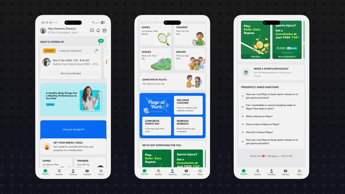
After a frustrating experience - I did finally navigate to the alerts tab and was able to accept the invite. I ping my host about the trouble in finding the invite. He responds with the same confusion. The squad is annoyed, but I sigh.
I know why this re-design got through, small hints being:
'Refreshed UI'
'Next generation'
'Spacious layout'
'Personalized'
Pitches likely promising a better experience, yet achieving the opposite.
Most of us can figure out there's something wrong with the app UI, Some may even point out the symptoms - card layout, color combination and so on... But I want you to scan the app layout and visualize the sequence in which information is given to the user. Here's how I see it:
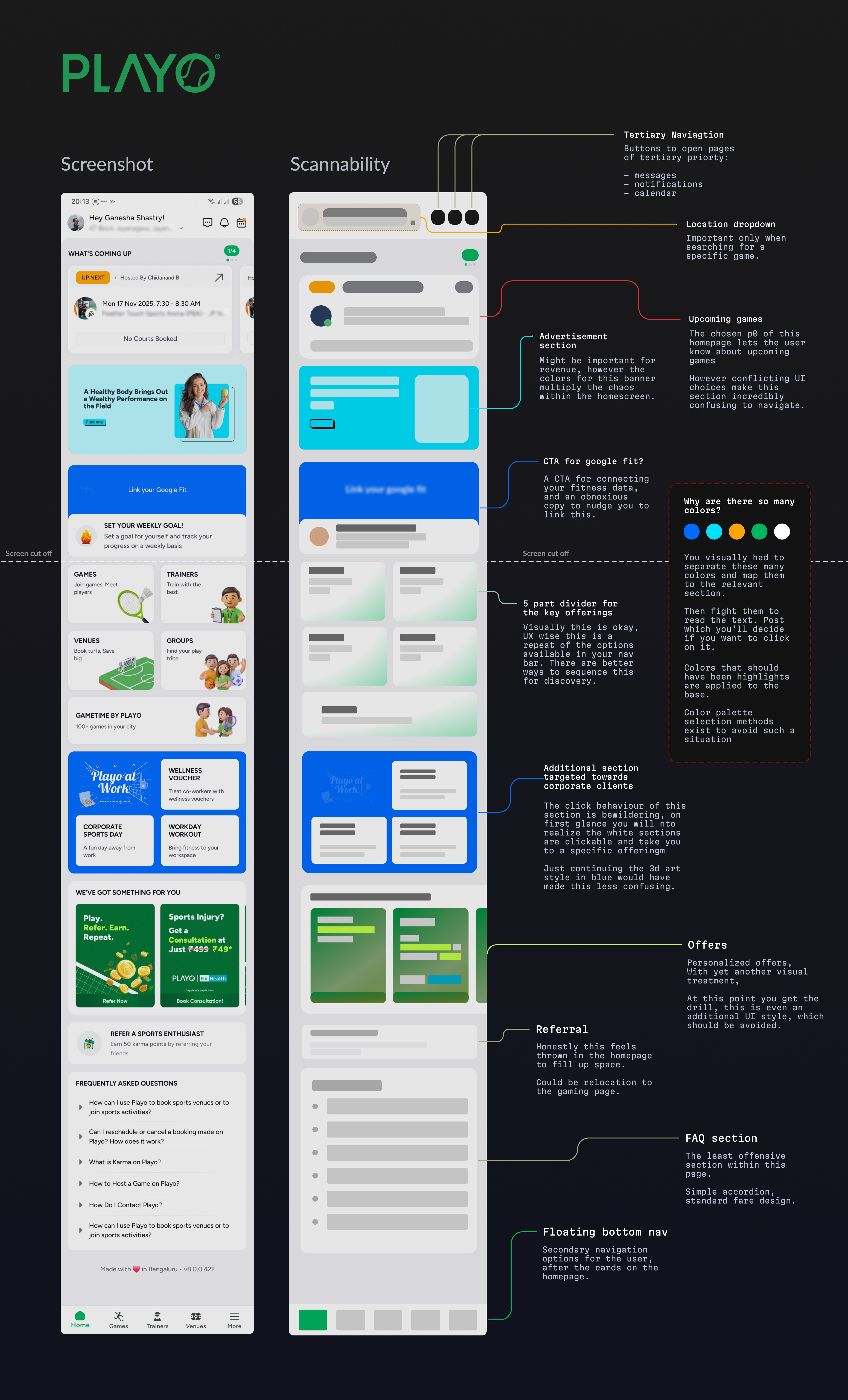
This sequence is called the visual hierarchy of the app
Digital surfaces we interact with today are unnecessarily hard to navigate. There are a lot of them, each with its own unique quirks. Fixing it means you give your users the chance to evaluate your service and not get stuck fighting the interface.
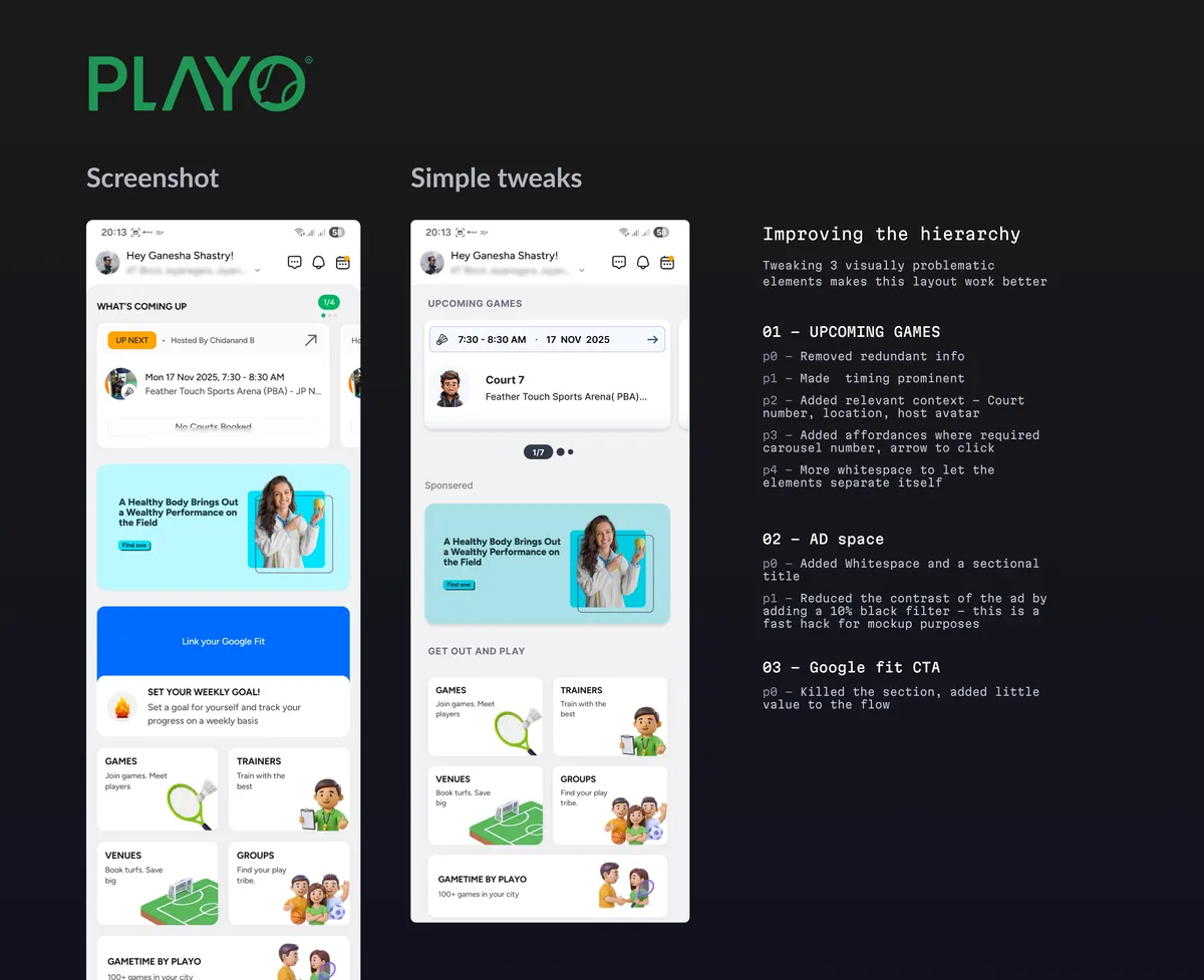
I spent ~ 20 mins to make some fixes to the first 3 sections within the app.
Let's assume this team develops a real high bar for visual hierarchy. Will the app be easier to navigate? Only by a little. The app still has:
- No sense of priority
- Conflicting sections
- Filler content
- Repeating information
and so on... To fix that, the team needs to streamline the information architecture of the product.
Information Architecture (IA) is -
"The practice of organizing and structuring content to make it easy to find and understand."
A straightforward goal but very hard to achieve in the real world. What's to be shown on an app is the net result of:
- Business/ leadership priorities
- Artifacts from the product team
- Technical feasibility
Explaining how an app's IA shapes up will turn this article into a 10 part essay. So let's revert the focus back to the bit around visual structure.
Visual hierarchy is a design principle
Let's take a look at another example - Swiggy.
Swiggy is a hyperlocal digital storefront that offers food, household essentials, and more... delivered to you within an hour. They use animations, 3d visuals, high quality photos, punchy colors — The whole range of visual design artifacts to try to delight its massive user base. Let's take a look.
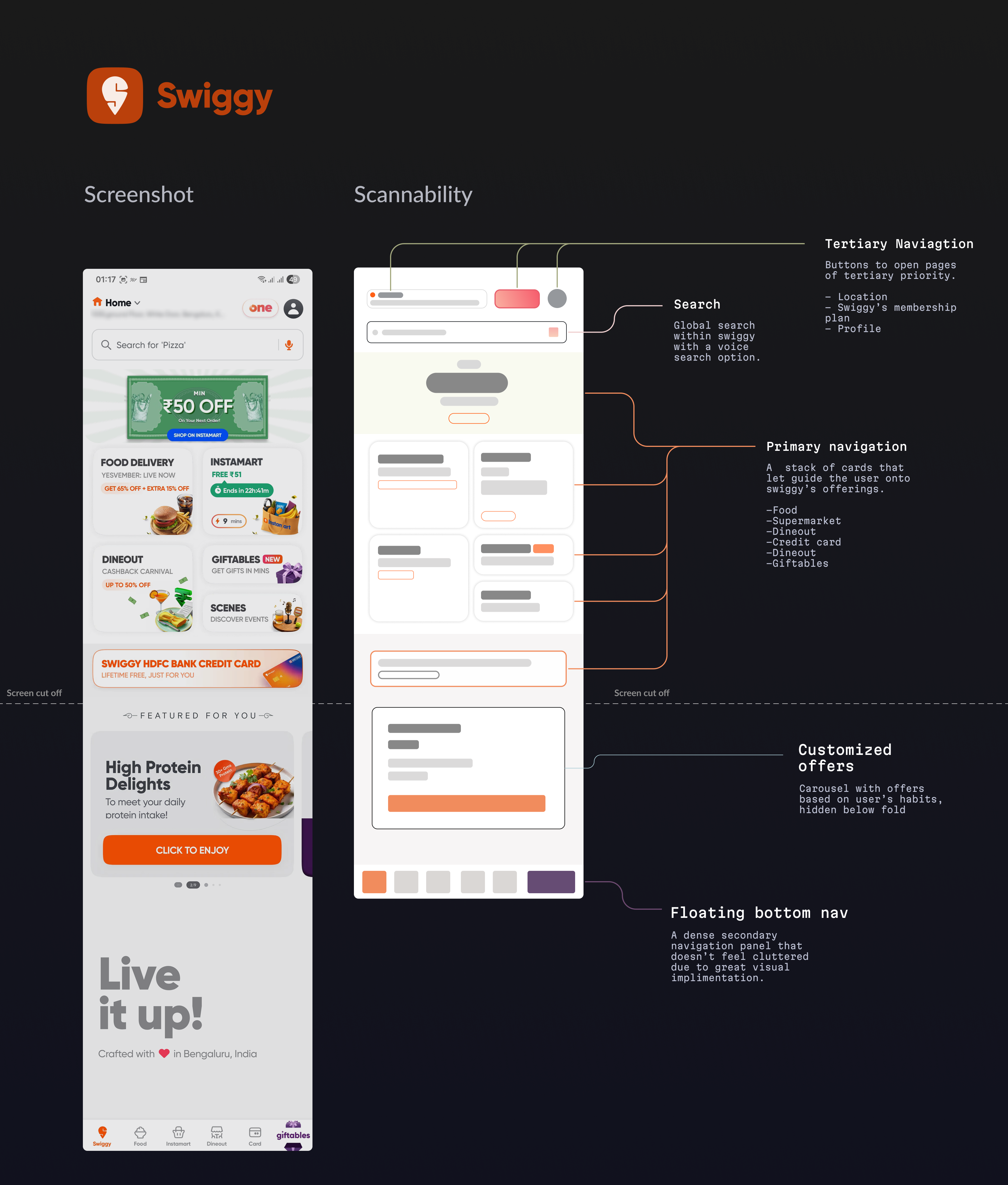
Compared to Playo — the difference is obvious. Every tap starts an important user journey. You rarely see repeating information, except where it makes sense. You can:
- Search for something specific via text or voice
- Order food
- Order various things from their supermart
- Going out for dining with offers
- Book tickets for live events
- Gifting someone an item
- Sign up for their credit card
and more...
The homepage is intuitive enough to navigate, until you go a bit further.
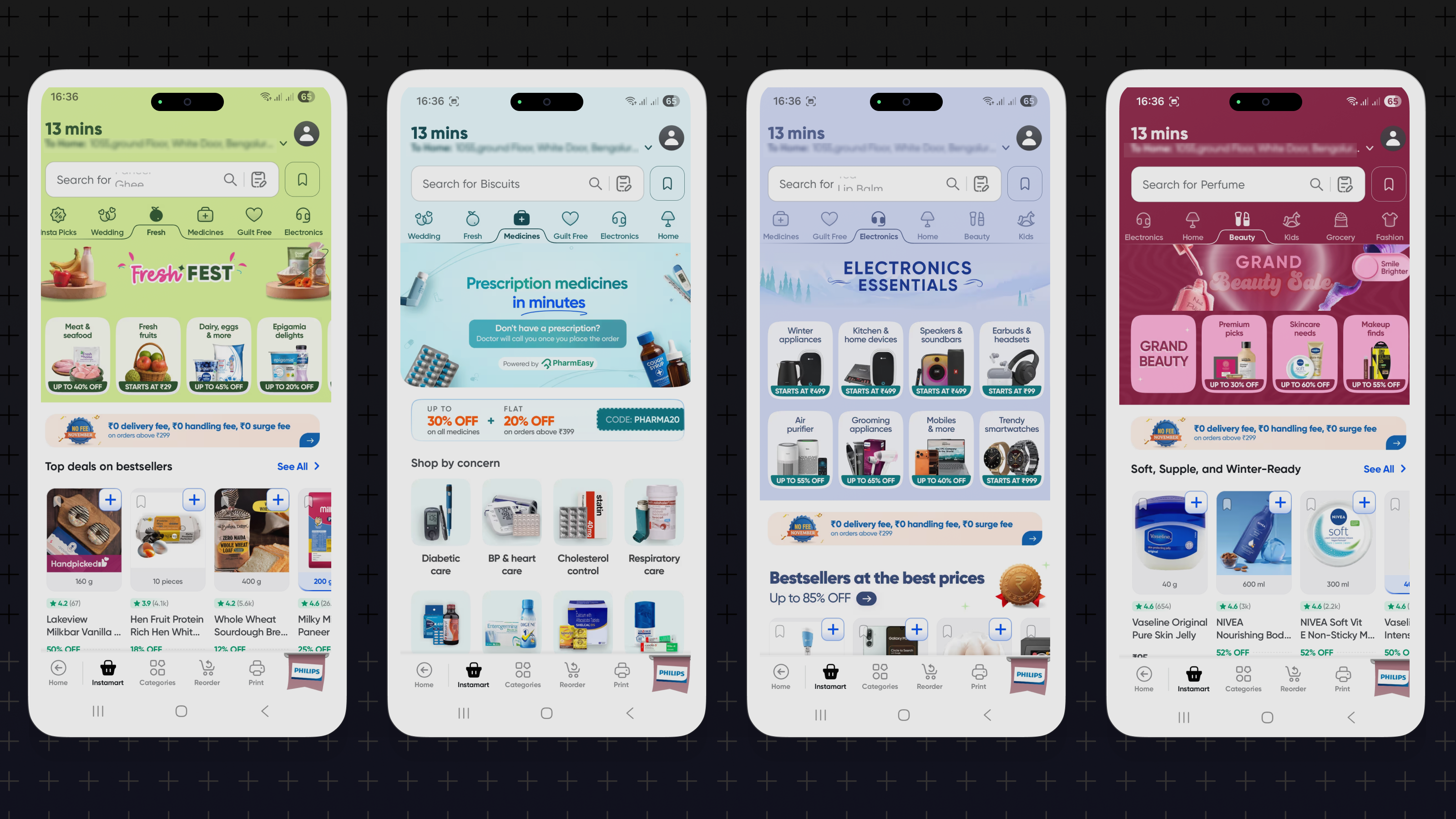
In the real world, business incentives force a lot of teams to sacrifice visual clarity for CTA's. This sets off a spiral of hijacking user attention from one section to another until the whole layout fails.
I'm pretty sure all these conflicting sections are pushed by product/ accounting teams to maximize their cart value. And at the end of the day, it is still a storefront, sigh...
Design principles are tool agnostic
All of this commentary is written to hopefully show you the difference a clean layout makes. Building applications is rapidly getting democratized with AI tools — It is now, more important than ever, to make yours intuitive to use.
Design principles, like visual hierarchy, can be applied across surfaces, as long as the GUI is relevant. There are many resources to get started - I'm listing 3 popular ones that will get you anyone up to speed on hierarchy.
Apple – Human Interface Guidelines (HIG)
Apple chooses clarity and focus — making key content immediately apparent and everything else supportive. Size, contrast, typography weight, layout and alignment make up apple's primary visual cues.
Google Material Design
Google strongly uses shadows and depth for z-axis differentiation. Cues include motion, elevation, and emphasis.
ShadCN
Shadcn is a breakout open source design system which has a high degree of polish. It is purpose built for the web but sees applications in mobile too. This is a great example to understand how component level visual hierarchy can be achieved
So what next?
AI promises to flatten the learning curve for product/ design. However, the non-deterministic nature of current gen AI tools make it unsuitable for serious work. One simply cannot offload anything meaningful to such a system without oversight.
Approaching design from a principle first, tool-agnostic mindset might be the way to go. Evaluate, iterate, repeat ? Jury's out...
Regards,
Ganesha
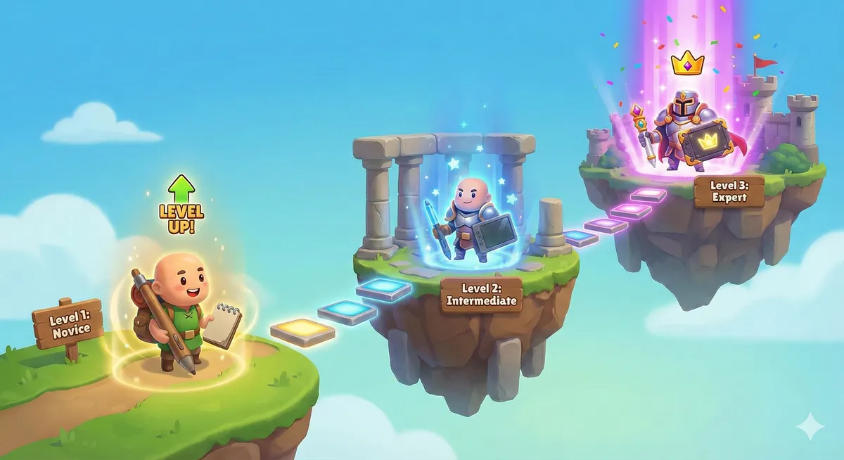
I asked Gemini 3 to visualize the learning curve from novice to expert and it shot out this illustration - good enough to be used in a blog... in the footnotes ;)
All em dashes in this post are hand typed.
Thanks a lot for reading this far into a design article — I'd love to hear what you think, reach out to me on: